ShopDreamUp AI ArtDreamUp
Deviation Actions


Comments19
Join the community to add your comment. Already a deviant? Log In
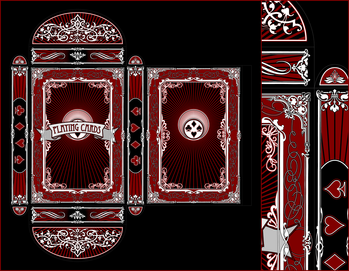
Always a good color choice - white, red, black. I'm glad you chose a dark red - it doesn't hurt the eyes in such abundance.
I like the reiteration of designs - it is all put together quite well.
There are only a few things that feel awkward:
- the center portion, the one that serves as the background for "playing cards" line - it feels like one of those designs which is supposed to move after you stare at it for too long. It adds unnecessary pressure, and takes our attention away from everything else. You could think of making those lines thicker, and less frequent, or maybe getting rid of them all together.... I just feel like they make the overall design overwhelming. I'm not sure how to correct them, but I wish for a sort of calm form that middle section.
- the large half oval sections - the design on them is pure white. Since it's thicker than everywhere else, it stands out a bit too much. Perhaps if it had additional darker lines, or was entirely from that grey/blue you've chosen on other portions of the work, it would have less of that shouting feeling, and fit in better with the rest of the work.